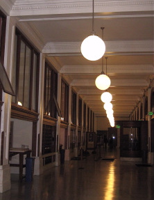
If walls could speak, Tacoma’s storied Old Post Office (OPO) would weave a tale that starts more than 100 years ago. Built in 1910, the grand edifice has served as more than the city’s postal headquarters: during World War I, it was a United Way volunteer center, and during the Cold War its thick walls provided a fallout shelter. Over the decades, the four-story building has housed the IRS, the FBI, customs, the U.S. Marshals, and the forestry service. In 1993, its wood-lined courtrooms appeared in the Harrison Ford movie, The Fugitive. And last year, Tacoma’s School of the Arts (SOTA) moved into the second floor, where some 500 students walk the halls during the school year.
All this, and a working post office, too.
This month, a new chapter unfolds: in conjunction with Spaceworks Tacoma, the OPO is hosting two art exhibitions in the grand lobby, by Brett Carlson and Scott Scoggin. Both shows open September 19 for the Third Thursday gallery walk.
According to property manager John Hunt of Power Property Consultants, the Spaceworks alliance is part of an innovative effort to bring professional artists and creative entrepreneurs (including restauranteurs, music producers, filmmakers and retailers) as tenants into the privately owned, mixed-use building. “We felt there was a need for flexible-use space for artists, entrepreneurs, non-profits and creative enterprise,” he says. “In our opinion, there was a glut of supply of more traditional office space in the downtown core and we felt there was a real shortage of the type of space the post office has to offer.”
Through Spaceworks, the OPO is offering vetted artists free exhibition and/or studio space for three to six month periods. “We like our tenant mix because it brings a real sense of community to the building,” he adds. With “the potential to become an artistic and entrepreneurial hub for the City.” Photographer and Spaceworks Creative Enterprise recipient Jason Ganwich currently occupies a spacious first-floor studio. The goal of the program is to activate vacant downtown retail space and create a synergistic relationship between property owners and artists who may ultimately become paying tenants (or attract others interested in leasing).
In the two current art exhibits, Scoggin and Carlson take over large wall display cases normally reserved for the postal service’s “Wanted” posters, and objects from the philatelic museum that once occupied the main floor.
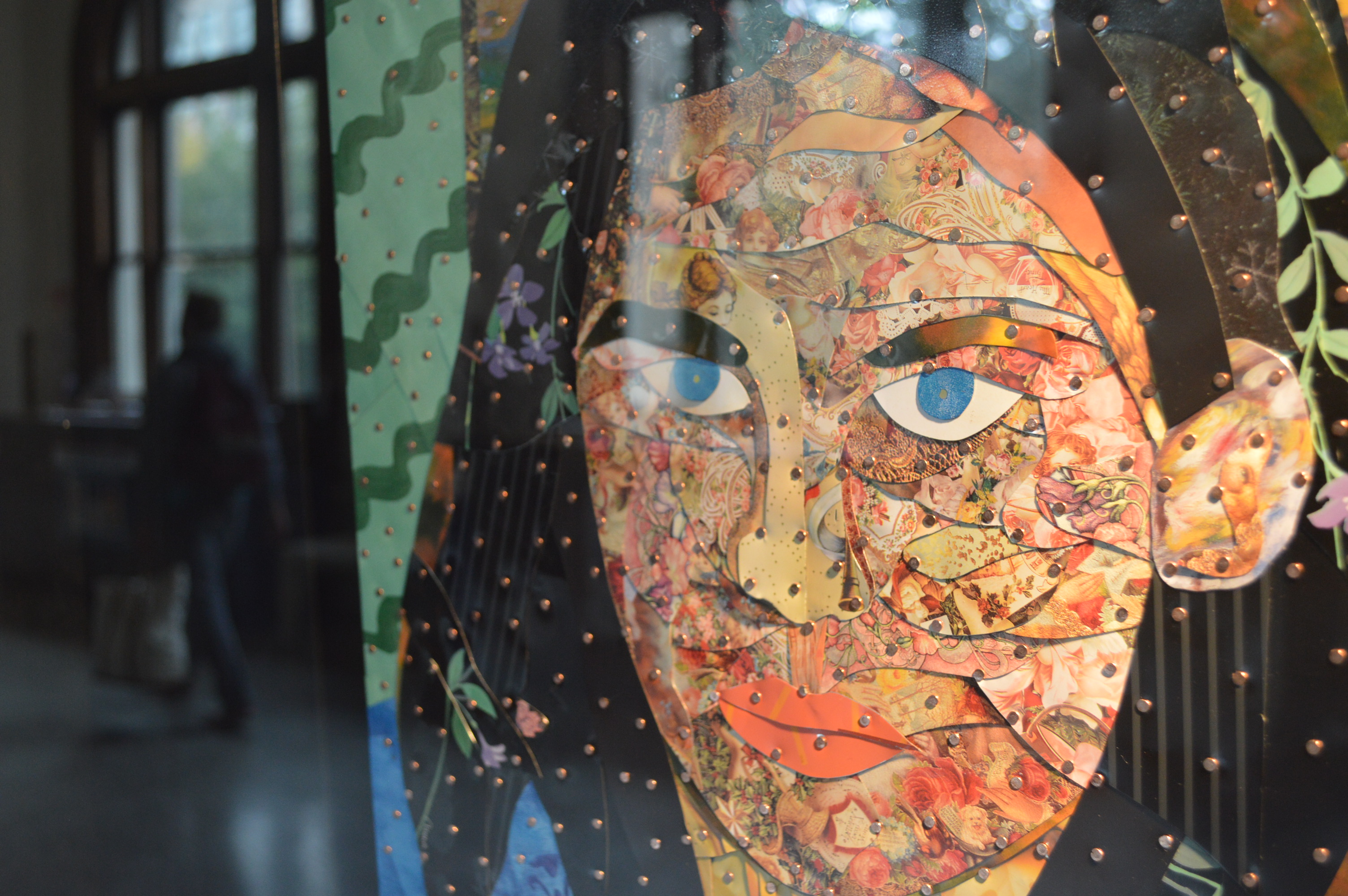
In Meta-tinations 2013, Carlson, a metal artist, continues his meticulous exploration of hand-cut tin, piecing together strips of metal reclaimed from diverse sources to create new images. The Meta-tinations series “presents visual images and messages utilizing recycled decorative containers in a collage-style format,” he writes in an artist statement. “By using recycled decorative tins, brads and wood, this represents a rebirth of iconic images into new concepts and visuals.”
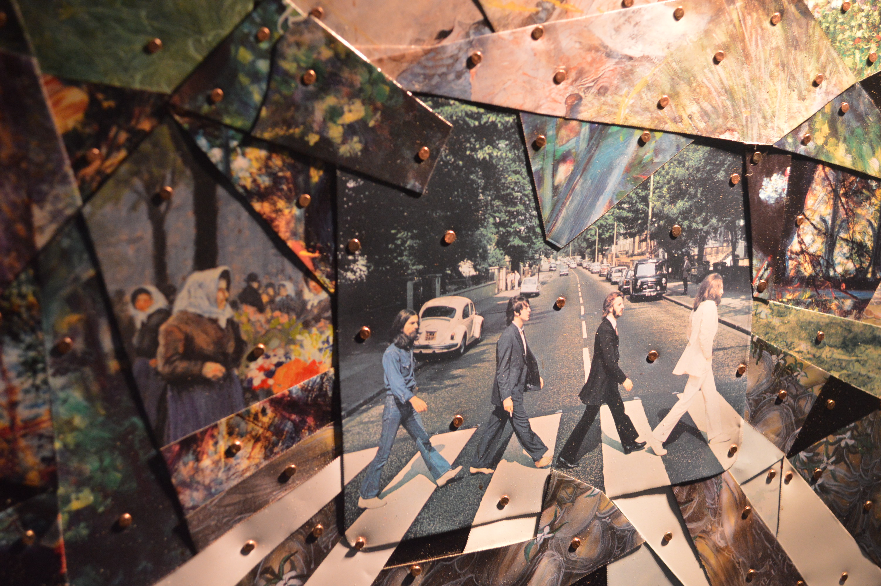
Each piece is composed of abstract shapes sheared from recycled tins, hammered together with approximately 250 brads “used to give a more contemporary style,” and mounted onto a plywood board. Recognizable and disparate images from cookie cans and random signage float through the newly created figurative work, spurring free association. In Amanda Knox Recycled, prim Victorian roses cover the face of the Seattle woman accused and acquitted of a lurid sex murder overseas, suggesting how the media – or Knox – may manipulate the defendant’s image. In A Day in the Life, a rendering of the cover of the Beatles’ Abbey Road album is superimposed with snippets from French Impressionist paintings, in a time-traveling continuum of psychedelia.
Carlson credits the development of his labor-intensive style to “having lived overseas for a third of my life and experiencing artists in other societies who devote so much time to a single project – something that is not always seen here in American society.” He has worked in 22 countries in Asia, and gives special significance to time spent in Bali, India, China, Indonesia, Thailand and Burma. In some of these countries, recycled tin (much of it from American products) is also a medium for folk art.
“The recycled part comes with a personal strong concern (shared by many) that we are consuming far too much and need to become as efficient as possible as our planet Earth population grows in excess of 7 billion,” he says. Inside the wall cases, beneath the artwork displayed, Carlson has also inserted mounds of cast-off tin, an effective way of showing his tools of the trade, while reminding viewers of the tremendous waste produced by over consumption.
* * * * *
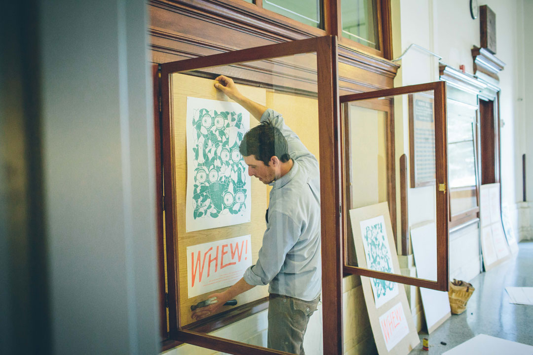
Graphic designer Scott Scoggin celebrates a year’s worth of poster design in a show called Whew! Why the exclamatory title? “I was definitely drawn to the word itself…And it does seem appropriate to the project.”
Whew! is actually the first of Scoggin’s two-part event at the OPO. The original, screen-printed posters will be on exhibit through December 20, 2013; plus, there will be a one-night pop-up show on Third Thursday, October 17, featuring live music and refreshments, and during which Scoggin will offer posters for sale. The newly hung installation offers a sneak peak of the pop-up show and includes limited-edition posters. The October event will feature all of the posters plus additional artwork.
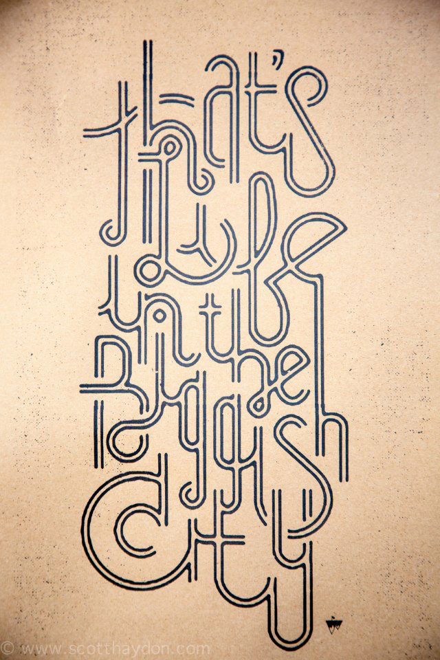
“I mostly wanted to create some work that was purely just for fun….[if people] liked it they could take it. It was about at the eighth poster that I thought it would be nice to have some sort of show featuring all the posters.”
Especially strong is a pair of black-and-white posters that repeat in a checkerboard grid pattern – one states, “Truer Words Have Never Been Spoken”; the other shows two raincoated figures from the chest down, their hands clasped in a handshake.
With his wife, Jacqui, Scoggin is half of the graphic design team of Slide Sideways. When he’s not stapling renegade poster art around town, he co-creates some of the coolest eco-accessories this side of REI.

Brett Carlson and Scott Scoggin at the Old Post Office, 1102 A St., through Dec. 20, 2013. ~Lisa Kinoshita
You must be logged in to post a comment.